Three people want your novel and they want it in three different shapes. An agent wants the first three chapters. A printer wants a PDF. A retailer wants an EPUB. So you export all three from the same document on the same afternoon, and by the evening you have a Word file the agent's reader cannot comfortably annotate, a paperback whose inside margin disappears into the spine around page 200, and an ebook that looks fine on your laptop and like a ransom note on somebody's Kobo.
The natural response is to hunt for the setting you got wrong. Usually there isn't one. You applied a correct setting to the wrong job, and that happens so reliably because all three outputs are called "formatting", as though they were degrees of one activity rather than three unrelated pieces of work with three unrelated audiences.
Double-spacing a novel is correct for submission and absurd in an ebook. Both of those are true at the same time.
Each file has a different reader, and the reader decides the rules
A submission manuscript is read by a person who intends to write on it. The double spacing, the wide margins, the ragged right edge: all of it leaves room for somebody else's handwriting. It is deliberately unlovely: a working surface.
A print interior is read by a machine that cuts and glues paper, and then by a person holding a fixed object. You chose the page size and cannot change it afterwards, and the object has properties your screen does not: a spine that eats the inner edge, two sides, and a habit of being manufactured in multiples of sixteen pages.
An EPUB is read by software on a device whose screen size, typeface and text size were chosen by somebody else, at a moment you will never observe. You do not control the page because there is no page. What you control is the structure (this is a chapter, this is a heading) and the reading system draws whatever it likes on top of it.
Manuscript format is a working surface, not a design
The de facto standard is William Shunn's manuscript format, which is what people mean by "standard manuscript format" without saying whose. It fits in a sentence: one-inch margins all round; 12-point Times New Roman or Courier New; double-spaced; first lines indented half an inch with no blank line between paragraphs; left-aligned with a ragged right edge; contact details top-left of page one and an approximate word count top-right; a header on every later page carrying your surname, a keyword from the title and the page number; and a centred hash on its own line at every scene break.
Shunn is explicit about why the ugly parts are there. Double spacing, because "the editor needs room between the lines to mark up your manuscript". Ragged right, because full justification is "a typesetting style for finished copy, not for manuscripts". A hash rather than a blank line, because a blank line at the foot of a page is a scene break nobody can see. Each is a decision about somebody else's working conditions.
SFWA's page, unchanged since 2005, still tells you to mark italics by underlining and to prefer monospaced fonts, which is a period piece for reasons worth their own section in a minute. What survives from it is the sentence explaining the whole genre: "the publisher supplies the format."
Do less than you think, and do it with styles
Once the manuscript looks tidy the temptation is to keep going: drop caps, a display face for the chapter headings, an ornament at the scene breaks. The University of Chicago Press puts the professional position bluntly: "if you spend a lot of time using your software to format your manuscript and customize the way it looks, we, in turn, must spend time paring your manuscript back to its basic elements." Any formatting except italic, they add, "will be stripped during initial file processing". You are not adding value; you are adding a task to a list.
What genuinely helps is the opposite of decoration: use your word processor's styles rather than direct formatting. Body text as a paragraph style with its indent set in the style, not by tabs. Chapter titles as Heading 1, not a paragraph you made large and bold by hand. Page breaks as page breaks, not twelve carriage returns. It is invisible work, and it means anyone downstream (a copyeditor, a typesetter, an EPUB converter, you in eight months) can restyle the whole book by changing one definition instead of picking through 400 pages. It also decides whether an automatic ebook conversion finds your chapters. And when the file comes back tracked, resist Accept All: the marginal queries are the point, because some of the fixes will be wrong about your book in ways only you can see.
And then the agent overrides all of it
Every rule above is a default for when nobody has told you anything, and somebody almost always has. Blake Friedmann want a 250–300 word synopsis and the first three chapters or 10,000 words as .doc or .docx ("please do not send PDFs or Pages") at 1.5 line spacing, with numbered pages, a cover page and a specific filename pattern. A.M. Heath want a covering letter, a summary and the first 10,000 words through a form on their website, into which you may simply paste the text: at which point every formatting decision you have ever made ceases to exist.
The 1.5 is not an error, and not a licence to ignore the convention. It is the convention bending to the person actually reading. Follow the guidelines exactly, use the standard format for whatever they were silent about, and spend any spare evening on the first five pages instead, because that is what the decision turns on.
The word count you report is real; the one they used to use wasn't
The belief that publishing counts words strangely is a half-memory of something true. Nobody in the typewriter era counted words, because counting 90,000 of anything by hand is not a job: they counted pages and multiplied. Shunn sets out the arithmetic: ten characters took up exactly an inch, and about 25 double-spaced lines fitted on a page, so a monospaced page at one-inch margins held roughly 1,500 characters. The publisher's rule was to take the character count, spaces included, and divide by six: six being one average word plus its space. Fifteen hundred over six is 250, and that is where "250 words a page" comes from.
Which explains both of SFWA's fossils at once. Underline rather than italic, because a typewriter had no italic. Monospaced rather than proportional, because the estimate collapses the moment a line can hold a variable number of characters: "if you change any of those factors… then the estimate of 250 words per page no longer holds". Shunn's conclusion is the sane one: "We have something better than an estimated word count now… an accurate computer word count." Report what your word processor says, rounded to the nearest thousand.
The estimating did not disappear, though; it moved one step down the line into an operation still called a castoff. Take the word count, divide by the words-per-page of a comparable book at the same trim and type size, add pages for front matter, back matter and chapter openings, then round to a multiple of sixteen: one signature, the folded sheet a book is actually printed on. Editors round up, because overshooting costs money and undershooting does not. Page count sets the spine width, the paper cost and eventually the price on the back, which is why an editor asking you to lose 4,000 words is sometimes making an arithmetic argument rather than an aesthetic one.
Front and back matter have an order, and each piece has a job
The sequence of pages around your chapters is not folklore. The Chicago Manual of Style sets it out in its first chapter under "Divisions and parts of a book" (§1.4 in both the 17th and 18th editions), and the 18th-edition running order goes like this.
- Praise pages, then the half title: the title alone on a recto, the book's first page and historically a protective wrapper for the title page behind it.
- Series title, frontispiece or two-page title on the facing verso, then the title page.
- Copyright page: rights, edition and printing history, ISBN, cataloguing data, credits, disclaimers. Chicago gives it eighteen numbered sections, which tells you how much lives there.
- Dedication, then epigraph: each alone on its own recto, set small rather than typeset like body text.
- Contents, then any list of illustrations or tables.
- Foreword (by somebody who is not you), then the preface (you, on the making of the book), which is where acknowledgments usually sit.
- Introduction, if it belongs to the front matter rather than to the argument of the book, which one it is decides whether it takes roman or arabic numbering. Then any list of abbreviations, publisher's or translator's notes, and (another 18th-edition addition) an accessible cover description.
Back matter runs: acknowledgments, appendixes, chronology, glossary, endnotes, bibliography, contributors, illustration credits, index, reading group guide, biographical note, colophon, errata. The one people reliably get wrong is that Chicago puts the glossary before the endnotes.
One detail underneath the order matters more than the order itself: front matter is paginated in lower-case roman numerals, and arabic page 1 is the first page of the text, which is why the half title is page i with no number printed on it. A novel needs a fraction of the list: half title, title, copyright, dedication, perhaps an epigraph; acknowledgments and an author's note at the back. But it needs them in the right places, which is the argument for treating front and back matter as real sections rather than as chapters with unusual titles. A dedication is not a chapter. It is typeset differently, it sits outside the numbering, and in an ebook it carries different markup.
In print you own the page, which is exactly why it can betray you
Start with trim size, because everything depends on it. KDP offers 5 × 8, 5.25 × 8, 5.5 × 8.5 and 6 × 9 inches among its standard options, and 6 × 9 is what the form defaults to; IngramSpark will cut a custom trim from 4 to 8.5 inches wide and 6 to 11 inches tall. Nobody publishes figures on which size novels most often use, so treat confident claims with suspicion. What matters is choosing early: a size settled at the end means re-flowing everything you already checked.
Then the margins, where self-published paperbacks most often fail. The inside margin (the gutter) has to grow with the page count, because a thicker book curves more sharply into its spine and swallows more of the inner edge. KDP publishes the table: 24 to 150 pages, 0.375 in; 151 to 300, 0.5 in; 301 to 500, 0.625 in; 501 to 700, 0.75 in; 701 to 828, 0.875 in. Outside, top and bottom want at least 0.25 in without bleed, or 0.375 in with it. IngramSpark instead recommends half an inch minimum on all sides.
Bleed only matters if something is meant to run off the edge, which a novel's interior rarely does. When you need it, the extra 0.125 in (3.2 mm) goes on the top, bottom and outside edges only, never the bind side; IngramSpark are direct about it: "Please do not add bleed to the bind (gutter) edge as this will cause incorrect positioning." They also allow themselves a 1/16-inch trim variance on every book they print, so nothing you care about should sit within two millimetres of the edge.
The rest is mechanical: Ingram want a single PDF conforming to PDF/X-1a:2001 or PDF/X-3:2002, greyscale for a mono interior, 300 ppi images, and every font embedded: "files with unembedded fonts will be rejected". Neither printer will tell you your book is ugly; they will only tell you it is invalid, which is a much lower bar.
Two sides, running heads, and the little sins of the page
A printed book has a recto (the right-hand page, always odd) and a verso, always even. That is not adjustable; it falls out of the way paper folds. Where chapters start, though, is house style rather than law: Princeton University Press requires the text to begin on a recto and then lets subsequent chapters open on either side. Recto-only openings cost pages too: half a blank page per chapter on average, so a 30-chapter novel spends about a signature on the elegance.
Running heads in fiction usually put the author's name on the verso and the title on the recto: book design aimed at the person holding it in a shop with the cover hidden. Chicago devotes seven sections to them, one (§1.16) purely to leaving them off, and that is the part that gets forgotten: no running head on a chapter opening, a part title, the half title, the title page, the copyright page, the dedication, or a blank page. The folio can stay at the foot; the head goes.
Finally, the named sins. An orphan is the opening line of a paragraph stranded at the bottom of a page; a widow is the closing line stranded at the top of the next, though Wikipedia's entry adds the caveat every typographer knows, that "the pairing of the two terms with their definitions has no consistent standard across the industry". There is a third, the runt: a short last line, which the Australian book producer Bookhouse usefully defines as one shorter than twice the first-line indent. Fix all three by editing the sentence, not by squeezing the type. A paragraph that loses a word loses its runt for good; a paragraph tracked 3% tighter looks tracked 3% tighter forever.
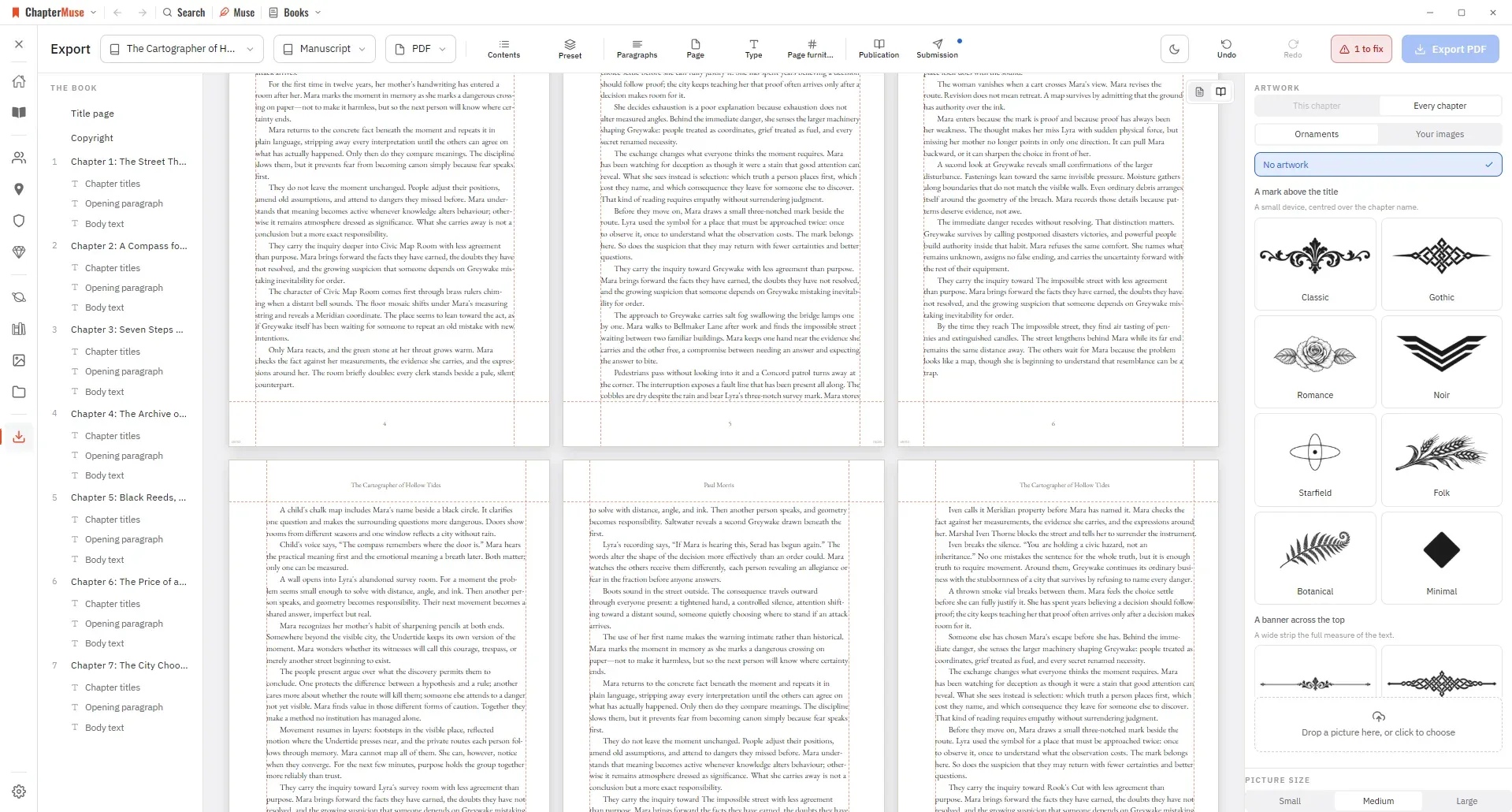
None of this needs a page-layout suite. It needs a view of the book as facing pages at its real trim, and a check that the geometry is legal before you upload.
An EPUB has no pages, and that is the entire design
Underneath the extension, an EPUB is a zip archive with rules. EPUB 3.3 (a W3C Recommendation since May 2023, currently at its January 2026 revision) requires a META-INF/container.xml pointing at a package document; the package document (the .opf) carries the metadata, a manifest of every file and a spine defining the default reading order; the content is XHTML; and a navigation document is mandatory. That is the whole architecture, and there is no page anywhere in it.
Reflowable is the default, and it is what a novel wants. The alternative, fixed layout, is expressed by setting the rendition:layout property to pre-paginated in the package document, and exists for picture books, comics and cookbooks: content where position on a spread carries meaning. Prose wants reflow, which means accepting that you have no control over where any given sentence lands.
Page 187, recto, a third of the way down, under a running head you suppressed.
You decided this, you can see it, and it is identical in every copy ever printed.
EPUB
Wherever the device puts it, at the size the reader chose, in the typeface they prefer.
You decided that it is a chapter. The reading system decided the rest, and it was right to.
In an EPUB you are not designing a page. You are describing a book and letting somebody else's software draw it.
Which is why semantic markup is the substance of ebook production rather than a nicety. A chapter heading should be a real heading element, because that is what the navigation document, the reader's "go to chapter" control and a screen reader all run on: not a paragraph you made 24 points and bold. On top of ordinary HTML, EPUB adds the epub:type attribute drawing on the Structural Semantics Vocabulary, which supplies terms for exactly the parts of a book the last section was about: frontmatter, bodymatter, backmatter, titlepage, chapter, toc, dedication, epigraph, colophon, acknowledgments. That last exists only in the American spelling: the kind of detail that costs an afternoon if you learn it from a validator.
What actually breaks
- Indents in fixed units. A half-inch first-line indent arrives as a handful of pixels once a device applies its own scaling. Set indents in em so they track the reader's chosen text size.
- Images sized in pixels. They will not scale down, so a 900-pixel illustration is fine on a tablet and clipped on a phone. Relative sizing with a maximum width, always.
- Embedded fonts. Most reading systems let the reader override the typeface and many do by default; anything beyond regular, italic, bold and bold italic is unreliable. Choose a face you would be content to lose.
- Clever CSS selectors. The classic is suppressing the first paragraph's indent with an adjacency selector. It works in a browser and quietly fails on some e-ink readers. Use an explicit class.
- Blank lines as scene breaks. An empty paragraph can collapse, and even when it survives it is invisible at the top or bottom of a screen. Make the break a thing in the file: a separator element, or a centred ornament in a styled paragraph.
Then validate, which for EPUB means something specific. EPUBCheck is the official conformance checker for EPUB publications, a W3C project maintained by the DAISY Consortium, currently at version 5.3.0; it runs as a command-line tool or a Java library, and the old web validator at validator.idpf.org is long gone. Running it is not optional, because an invalid package is the commonest reason an upload is refused, and a tool that runs the real validator on the file it just produced tells you something a preview pane cannot. One Kindle note, since old instructions still circulate: KDP stopped accepting MOBI on 18 March 2025, and a reflowable Kindle book now goes up as EPUB, DOCX or KPF and is converted to Amazon's own format on the way in. Preview the conversion, not your source.
Ebook accessibility is now a supply-chain requirement, not a courtesy
The technical standard is EPUB Accessibility 1.1, a W3C Recommendation since 17 October 2024, worth quoting accurately because it is routinely overstated. A conforming publication "MUST, at the minimum, meet the requirements of WCAG 2.0" and "MUST… meet the requirements of Level A", with the latest WCAG 2 at Level AA only "strongly recommended". So the normative floor is Level A: of which the specification itself drily observes that "most accessibility practitioners do not recognize this level as providing a high degree of accessibility". Where AA becomes a requirement, it becomes one through law. The standard also requires three metadata properties on every publication (accessMode, accessibilityFeature and accessibilityHazard) so a reader who needs to know whether a book will work for them can find out in the shop, not afterwards.
The European Accessibility Act, as it actually stands
Directive (EU) 2019/882, the European Accessibility Act, has applied since 28 June 2025. Ebooks are explicitly in scope: Article 2(2)(e) lists "e-books and dedicated software" as a covered service, and Article 2(1) lists e-readers as covered products. This is real, in force, and why your distributor has started emailing you about metadata.
The detail, though, is widely mangled. Article 4(5) exempts microenterprises providing services, and Article 3(23) defines a microenterprise as one employing fewer than ten people and having either an annual turnover or a balance sheet total not exceeding €2 million. Note the conjunctions: the headcount test is mandatory, the financial one an either/or. Plenty of write-ups render it as "fewer than ten people or under €2 million", which is wrong and much too generous. The exemption covers services, not products, and Article 32 adds transitional cover to 28 June 2030 for service providers still using products they were lawfully using before the deadline.
So is a self-publishing novelist legally obliged? The Directive addresses service providers and manufacturers, not authors, and Fondazione LIA (one of the bodies actually advising publishers on this) states plainly that authors face no direct obligations. Your retailer, though, is a service provider, is not a microenterprise, and has its own compliance problem, which it will solve partly by asking you for accessible files and accurate metadata. That is the mechanism by which this reaches you: not enforcement, but supply chain.
Set the legal question aside, though, because it obscures a cheerful fact: a novel is the easiest content in the world to make accessible. It is text: no charts, no video, no widgets, and typically two images, a cover and possibly a map. Real headings in the right order, a sensible reading order in the spine, a declared language, honest alt text on the map, and no words rendered as pictures gets you most of the way. Ace, the DAISY Consortium's accessibility checker for EPUB, finds the mechanical gaps EPUBCheck ignores. It cannot write your alt text, which is the one part of the job that is actually writing.
Open every file in something that did not make it
Here is why previews lie, and it applies to every tool including this one. An export function and its preview pane usually share the same code, so if the exporter misunderstands your chapter headings, the preview misunderstands them identically and looks correct, because "correct" is being defined by the thing that is wrong. The only check with any power is one made by software that had no hand in making the file.
That last instruction is the one people skip and the one that finds the most. Nearly every ebook defect is invisible at the default text size and obvious at the largest: the fixed-width image that overflows, the heading that wraps to four lines, the scene break that vanished because it was an empty paragraph. You are looking at the book the way a reader with low vision looks at it, which happens to be the same way it fails.
And when it does fail, resist fixing it in the output. A PDF corrected by hand is corrected once, and the next export undoes it. Go back to the manuscript, fix the thing that produced the fault, and export again: the same principle as the revision pass you have just come out of. Work at the level where the problem was made, not the level where you noticed it.
Sources and further reading
- 01William Shunn, Proper Manuscript Format: the de facto submission standard, and its own account of why double spacing and ragged right exist
- 02The Chicago Manual of Style, 18th ed., ch. 1: "Divisions and parts of a book" (§1.4): front- and back-matter order, running heads (§1.10–1.16) and determining page 1 (§1.52)
- 03University of Chicago Press, Manuscript Preparation Guidelines: the publisher's view of author formatting: everything but italic is stripped on ingest
- 04Amazon KDP, Set Trim Size, Bleed, and Margins: the inside-margin table by page count, outside margins, and the bleed formula
- 05IngramSpark, File Creation Guide: PDF/X requirements, embedded fonts, bleed on three edges only, resolution and trim variance
- 06W3C, EPUB 3.3 (Recommendation): container, package document, spine, XHTML content, and rendition:layout for fixed layouts
- 07W3C, EPUB Accessibility 1.1 (Recommendation, 17 October 2024): the WCAG conformance floor and the required discovery metadata
- 08Directive (EU) 2019/882: the European Accessibility Act: in application since 28 June 2025; ebooks in scope, and the Article 4(5) microenterprise exemption
Common questions
- What format do literary agents want for a novel?
- A .doc or .docx file in standard manuscript format unless they say otherwise: 12-point type, double-spaced, one-inch margins, half-inch first-line indents, ragged right, and a header with your surname, a title keyword and the page number. Then read the agency's own guidelines and do exactly what those say instead, because they differ: one London agency asks for 1.5 spacing and explicitly refuses PDFs, and another has you paste the first 10,000 words into a web form.
- What is a reflowable ebook?
- One with no fixed pages. The text rearranges itself to fit whatever screen, typeface and text size the reader has chosen, so the same book is 300 "pages" on one device and 700 on another. It is the default in EPUB 3 and the right choice for prose. The alternative, fixed layout, freezes each page and is set by marking the publication pre-paginated in the package document: appropriate for picture books and comics, wrong for a novel.
- How wide should the gutter margin be in a paperback?
- It depends on how thick the book is, because a fatter book curves more into its spine. KDP requires 0.375 in up to 150 pages, 0.5 in from 151 to 300, 0.625 in from 301 to 500, 0.75 in from 501 to 700 and 0.875 in beyond. IngramSpark instead recommends a flat half-inch minimum on every side. The classic mistake is setting the gutter early and never revisiting it once the book has grown.
- Do I have to make my ebook accessible to sell it in the EU?
- The European Accessibility Act has applied since 28 June 2025 and covers ebooks explicitly, but it places obligations on service providers and manufacturers rather than on authors, and it exempts microenterprises providing services: fewer than ten employees and either turnover or balance sheet under €2 million. In practice the requirement reaches you through your retailer, who is not exempt and who will ask you for accessible files and accessibility metadata. Since a novel is almost all text, meeting the standard is mostly real headings, a correct reading order and alt text on your two images.
- Should I use styles or just format the text directly?
- Styles, always, even though the file looks identical either way. A document built from styles can be restyled (into print, into EPUB, into a publisher's house design) by changing one definition. A document formatted by hand has to be unpicked by hand, which is why presses warn that elaborate author formatting is simply stripped on ingest. It is also the difference between an automatic ebook conversion that finds your chapters and one that does not.